Assigment 3: Colour

In this Assigment we have to use different colours in deliberate relationships.

There are four groups which illustrate the colour relationships:


  1. Colour harmony through complementary colours.
Camera body: Nikon d90
Lens: Nikkor 70-300 mm f/4,0-5,6
f/11    1/350 s    ISO 640
Focal length: 135 mm

This is the Prague Astronomical clock. The Medieval "orloj" dates from the 15th century and It's the most popular tourist attraction in Prague. Every hour there's a show on it: the procession of the Twelve Apostles and it also has a ring with the sings of the zodiac.
I found it odd and I took some pictures. When I processed this image I really liked it because of the colour and the mystic sense that causes on me. 

colour sketch


If we analyze the picture by its colours, we have three main colours in it: blue, orange and yellow. So we have a colour harmony through complementary colours (blue/orange) and both colours achieve the ideal proportion between them (1:2).

Camera body: Nikon d90
Lens: Nikkor 18-55 mm f/3,5-5,6
f/11    1/180 s    ISO 200
Focal length: 55 mm

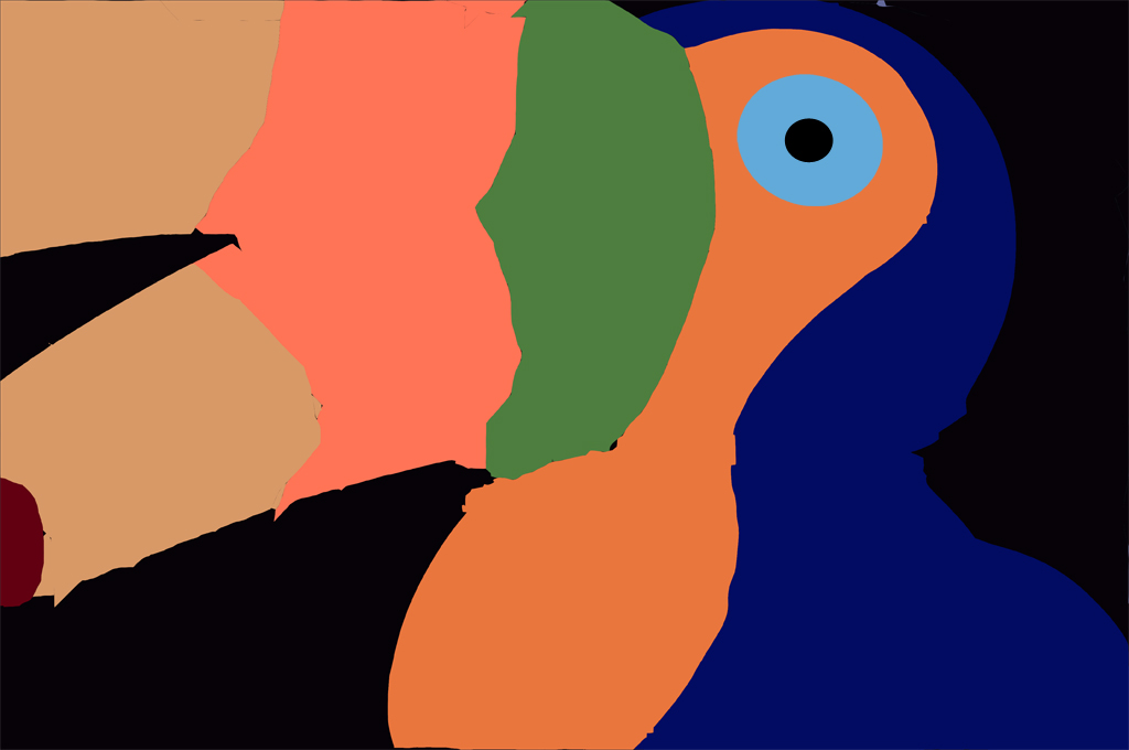
I've also chosen colour harmony through blue/orange for the second image. But this time I prepared a still life at home. I took this colourful toucan and set a black background. The difference between the picture above are that saturation is higher this time and here I didn't follow the ideal proportions theory because what I was following in this picture was vivid colours. To get those vivid colours and increase saturation, I underexposed the photograph a little. Maybe some people can tell that it's dark but I like as it is and I'm very happy with the result.

I've started to like the studio photography and still life so I tried another shot for this Assigment but this time, I changed the colours and chose red and green to get the colour harmony.


Camera body: Nikon d90
Lens: Nikkor 70-300 mm f/4,0-5,6
f/16    1/90 s    ISO 200
Focal length: 190 mm

Colour sketch

Here, I set a red background and I used my ipod and the Heineken mini couch as my green subjects. At first they were the only subjects and my intention was leaving space in the right side and putting the ipod on the couch but looking at the view I guessed that the idea wasn't going to work; the image wouldn't be balanced. So I decided to fill the right side supporting the ipod on the couch and create a relationship between the two subjects. 

Then I had another problem: the ipod couldn't be supported as it's shown in the picture so I had to add another element in the back. I found a red canddle so I used it and it helped the image to have some depth. Finally I found the couch very simple and I added the cherry tomatoes trying to balance the image. 

In my opinion I was succesfull in getting a harmonious picture through red and green colours.

Altough there is no specified that we have to used all the complementary colours for the Assigment I wanted to get a photograph balanced by purple and yellow colours. I knew that it's the most difficult colour combination and I wanted to be original in the election of the subject. I didn't want to shoot flowers because they are the usual subjects in most purple/yellow combinations. And I got it:

Camera body: Nikon d90
Lens: Nikkor 70-300 mm f/4,0-5,6
f/4,0    1/250 s    ISO 1600
Focal length: 70 mm
Camera on tripod.

Colour sketch

I have adjusted the contrast in Lightroom to give more drama to the image. The photograph was taken in a rowing champioship. The light was not enough to freeze the ships movement so I had to set a high ISO such as 1600. I prefered noise than blurry movement because my goal was to shoot colour combination not speed. 

I tried to keep the ideal proportion of 1:3 in the image but I guess that the yellow boat should be in the background and the purple one in the foreground and I should crop a little more the yellow boat. But anyway, both colours work well together in the picture and the greenish water adds drama to the competition.

The picture would improve if it were sharper. This is because I had to use an aperture such as f/4,0 because I wanted to increase my shutter speed as much as possible to freeze movement but I had to open the aperture and this affected to DOF. And after having examined the framing, I also have to tell that placing the boats in diagonal would have given more drama and dinamism to the image.


2. Colour harmony through similar colours.

The colours near each other on the colour wheel or in a cool or warm range of colours help to get colour harmony, so let's explore them.

Camera body: Nikon d90
Lens: Nikkor 18-55 mm f/3,5-5,6
f/4,0    1/60 s    ISO 1600
Focal length: 18 mm
It's a glass building in London. I got very close to it and shooted inside giving an abstract sense to the image. The green and blue combination reminds me to a sci-fi film scene. The colours combine properly to give an unnatural aspect to the picture, which is what I intended to show.  

Camera body: Nikon d90
Lens: Nikkor 18-55 mm f/3,5-5,6
f/5,6    1/3000 s    ISO 800
Focal length: 52 mm
colour sketch

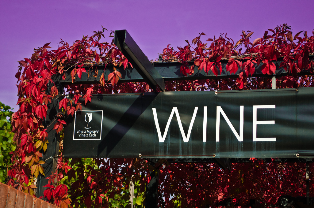
I went to a wine festival in Prague and while I was walking around the vineyards I saw the sign. I loved the red leaves around it and I started to imagine about adjusting the colour of the sky to make it purple and show as a reference to red wine. 

I changed the blue sky for the purple one in Lightroom. I wanted to make it as wine colour but I also wanted to be realistic, so I didn't want to manipulate the image too much. And yes, maniulation is evident but I also have seen this colour in the sky in the summer so I decided it was acceptable like that.

This shows my "wine glass" experience in Prague using purple and red colour to balance the harmony in the picture.

Camera body: Nikon d90
Lens: Nikkor 18-55 mm f/3,5-5,6
udiof/4,8    1/60 s    ISO 800
Focal length: 18 mm
Flash used.

Here I have used the warm range of colours to create harmony in the picture. Everything is brownish, orangish or yellowish in the image, even the lighting helps to create that sensation altough I used the camera's built in flash. 

The image was taken in the Golden Lane in Prague Castle. I don't know exactly what was recreated here but in my opinion this is like a wax or glass working studio and following my supposition,  heat and fire were essential while it was operative, so warm colours work pretty well to remind this place's original appearance. 

It would be a wonderful background to make an artist or worker portrait. An human figure could make the image more interesting but anyway the photograph captures the attention because there are lots of details and the warm colour range helps to set the atmosphere.


Camera body: Nikon d90
Lens: Tamron 90 mm Macro f/2,8
f/16    1/125 s    ISO 200
Flash used.
After shooting outside I decided it was time to retry a still life so researching on the web, I saw an image of a pear made by other fruit pieces. I took the idea by instead of trying to recreate the shape of the apple I tried to break the idea and made an unrealistic image to finish this part of the Assigment, like the first picture (the blue/green abstract building).

So I cut an apple into two pieces and then added some lemon, orange and tangerine pieces in the middle to get, finally, a fruit hamburguer. 

I think the picture works well by its shape but I would remove the tangerine piece in the top and I also would change the dish by another one because the red flower contrasts with the apple and is distracting. In my opinion changing this two thing the picture would improve and colour harmony would be created through similar colours. 

3. Colour contrast through contrasting colours.

Camera body: Nikon d90
Lens: Nikkor 18-55 mm f/3,5-5,6
f/3,5    1/60 s    ISO 400
Focal length: 18 mm
Flash used.

This is a room located in the Hermitage museum (St. Petersburg, Russia). Like every palace in Russia, it's really astonishing and elegant. 

The room is called the Red Room for obvious reasons. The baroque style golden ornaments contrast with the red upholstery in the chairs and walls. 

The room is twice wide as it shown in the picture decide to crop the framing because of two reasons: the distortion caused by the wide angle lens and because I liked this pont of view in which I captured the reflection of the lamp and the position of the female statue. There is another reason that is hardly visible: there's a hidden door in the centre of the image!

Camera body: Nikon d90
Lens: Nikkor 18-55 mm f/3,5-5,6
f/11    1/180 s    ISO 1000
Focal length: 22 mm
This is an autumm scene which I like because it's contrast between the orange dead leaves in the foreground, the saturated green in the middle and the different green-orange tones in the background.

The low point of view and the tree in the right side, also give a special environment to the picture. Altough some branches are a little bit distracting, this is one of my favourite pictures in this Assigment, because of the contrasting and vivid colours. I have made the sky to be washed out, without any detail to centre the attention on the dead leaves and the trees in the background.

Camera body: Nikon d90
Lens: Nikkor 70-300 mm f/4,0-5,6
f/4,0    1/60 s    ISO 200
Focal length: 70 mm
colour sketch
I took this picture in Covent Garden, London from a higher point of view. The smoked yellow paella attracted my attention inmediately and then I saw the woman's blue shirt which contrasted with the paella. 

Furthermore, the contrasting red and yellow peppers in the right corner help to add interest to the scene.

Camera body: Nikon d90
Lens: Nikkor 18-55 mm f/3,5-5,6
f/5,6    1/125 s    ISO 200
Focal length: 55 mm

Colour sketch
Another contrasting colour combination would be created by green and purple. 

I found this flower in the edge of a path. It was the only flower around and this captured my attention. So I decided to place it in the centre of the frame and set a large aperture such as f/4,0 to get a shallow DOF. This would made the background blurry and it would become less distractive, giving all the attention to the flower. 

If we examine the image according to Goethe's colour brightness theory, the ideal proportion would be 1:2 because he gave to green  a level of 6 and to purple a level of 3. The picture doesn't follow the theory; but placing the purple in the centre the sense of this proportion becomes stronger. 


4. Colour accent using any of the above.

Camera body: Nikon d90
Lens: Nikkor 70-300 mm f/4,0-5,6
f/11    1/100 s    ISO 400
Focal length: 130 mm

colour sketch
My first attempt to photography a colour accent image was using complementary colours. I found a red little pine among thoushand of green pines and I didn't have any doubt in taking the picture. The scene transmited me the feeling that the little red pine was fighting to survive among its healthy brothers.

What I was trying to communicate with the image is the fire, the fight to survive in nature; so I use the red accent because its amount in the screen is smaller but it gives that strength to the image.

For the next picture I also use red accent but in this case, the background is blue, so it becomes a colour accent picture using contrasting colours.

Camera body: Nikon d90
Lens: Nikkor 7'-300 mm f/4,0-5,6
f/5,6    1/250 s    ISO 1600
Focal length: 300 mm

colour sketch

I've applied the old polar preset in Lightroom to this picture because it reminds to tradition. Rowing is a traditional basque sport that unlike most parts in the world, is practiced at sea. Altough today the boats and oars are addapted to the present they haven't changed its original shape and the original confrontation between the different villages is already present, so the blueish preset gives this traditional atosphere to the scene.

But the red flag contrasts with the blue in the picture and adds dinamism, in the sense that it becomes a goal to be reached by the blue boat's crew. 

Camera body: Nikon d90
Lens: Nikkor 18-55 mm f/3,5-5,6
f/11    1/125 s    ISO 1000
Focal length: 42 mm

colour sketch
I took the picture in a golf club.  I loved the quiet sensation caused by the inmense green in font of me. It was quitea windy day but ir's hardly noticed unless you pay attention to the red flag.

So the red accent using complementary colours helps to add some dinamism in a peaceful scenerey. Maybe if I had arrived sometime before the light wold be better and the great tree in the right would be brighter and more impressive but I'm quite happy with the image.

And finally, the last picture in this Assigment.

Camera body: Nikon d90
Lens: Tamron 90 mm Macro f/2,8
f/3,3    1/3 s    ISO 400
Tripod used.

colour sketch

Well, here I use two orange spots to act as color accents. At first, my idea was to use this picture for the first group (colour harmony through complementary colours) but I changed my mind and clasified it as colour accent using complementary colours.

The two orange spots creates a relationship between them but also between the rest of the image because of their rounded shape and the attract the attention to the centre circle.

I have sent more pictures which are not included in this Assigment  to my tutor. They were some picture I was unsure about them and I discarded in favour of those shown here.


Exercise: Colours into tones in black and white

The original image in colour for this exercise:

Camera body: Nikon d90
Lens: Nikkor 18-55mm f/3,5-5,6
f/11   1/60 s   ISO 1000
Focal length: 24 mm
I used a still life with contrasting colours but I didn't have any grey card so I used a grey cardboard box.

Then I converted into a B&W image in Photoshop:

Grayscale

Red filter

Yellow filter

Green filter

Blue fllter

I made the same thing in Lightroom because I wanted to check if there is any difference between the preset filters.

Grayscale

Red filter

Yellow filter


Green filter

Blue filter

If we apply any of the colour filters in B&W we make the colour of the filter middle grey. 

Red filter makes the red ruler middle grey, and its complementary, the green, nearly the same but the yellow and orange brighter and blue and purple dark grey. 

Yellow filter darkens the blue while the rest colours are brighter.

Green filter gives to red and green colours same brightness and it's the filter which reflects better the brightness as it is in my opinion.

In the blue filter, the blue stapler is middle grey and its complementary, the orange colour looks black and the yellow and red are also darker, but purple is brighter.

There are some differences between the filter presets in Photoshop or Lightroom. The main differences are noticed in Red and Yellow filters, in Photoshop yellow and orange colour appear as white without detail, much brighter than the background which is white!

The other difference is with blue filter. In photoshop the filters darkens much more the yellow colour and we can't notice the difference between the yellow and orange in the flower while that difference is clear with Lightroom's blue filter. And even the overall image is darker in Photoshop.


Exercise: Colour relationships

This exercise is divided in two parts. In the first one, we have to produce  one potograph for each combination of primary and secondary colours, adjusting the distance, focal lengthor framing to compose the picture to the next proportions:


    • Red-Green       1:1
    • Orange-Blue    1:2
    • Yellow-Violet  1:3


So let's start with the red-green combination.

Camera body: Nikon d90
Lens: Nikkor 70-300 mm f/4,0-5,6
Focal Length: 190 mm
f/11    1/250s   ISO 800

I took this picture in my last trip to London. We went to Buckingham Palace to watch the Guard Change. I placed myself in a good location and while I waited the Guards I looked for a green background to balance the Guards red jackets. When they appeared I adjusted my focal length to shoot as much green as red in the image. I was afraid that the floor could break the balance between the green and red colours but I think it works well.

This one was the easiest image in this part of the exercise because it's not difficult to find green or red subjects to photography. But the other two pictures were not going to be as easy. Here's the next combination: orange-blue.

Camera body: Nikon d90
Lens: Nikkor 18-55 mm f/3,5-5,6
Focal Length: 50 mm
f/18    3 sec.   ISO 200
Camera on tripod.
I used a sunset to complete the blue-orange combination. Here the tricky part of the exercise was in the water reflections. I found difficult to calculate the 1:2 relation. I've never been very good calculating distances and proportions; but here I had to put my attention also in how much orange was reflected in the water to set the focal distance and save the 1:2 proportion.  

I included the branches for two reasons. One obvious, that I couldn't find a place to remove from the framing and the other because in my opinion they added some interest on the top where there is too much sky shown to compensate the 1:2 proportion.

And finally we have the third combination: Yellow-violet. 

Camera body: Nikon d90
Lens: Tamron 90 mm f/2,8
f/5,6    1/125 s   ISO 200
The third picture has to combine yellow and violet in a proportion of 1:3 because yellow is much brighter than violet so it needs a third part of this quantity to balance the framing. To get this proportion I had to crop the framing much more than in the images above. Here we also have green colour which in my opinion helps to make the image more appealing.

The second part of the exercise consists in producing some images which feature colour combination that appeal to me. This is the first one:

Camera body: Nikon d90
Lens: Nikkor 18-55mm f/3,5-5,6
f/11   1/500 s   ISO 500
Focal length: 20 mm
Here we have the opposite case from the ideal colour proportions for how much each colour occupies in the frame because the quantity of blue colour should be twice larger than of orange because orange is twice as bright as blue. Here there's a lot of orange and little of blue, but in my opinion it gives contrast to image and centres the attention towards it. The green opposite the blue also helps to balance the image. 

Altough colours are certainly appealing in the image, there's another element that kept my attention and this is the frozen position of the bird and how the two characters help to direct the eye towards the bird. At first the guy with the blue shirt is the main attraction but if we follow his eyes we centre our attention in the woman and we startt asking where she is looking at. Then we discover the little bird which is going to take off.

Camera body: Nikon d90
Lens: Nikkor 18-55mm f/3,5-5,6
f/16   1/60 s   ISO 640
Focal length: 20 mm
This is another picture from the same market. I wasn't sure about it because of the lighting. It was midday in a sunny day and one part of the scene was in shadow while the other was under the sun. I opted to measure both parts and set an average exposure in my camera because I did not want to lose the image.

I loved how the colours of the bell peppers and the other vegetables looked under the red umbrella. They were very saturated so I enhanced this saturation in Lightroom adjusting the overall contrast because it's what makes the image so interesting.
 
The green of the vegetables is balanced by the red, orange and yellow of the bell peppers, the yellow bag and the orange umbrella in the background.


Camera body: Nikon d90
Lens: Nikkor 70-300mm f/4,0-5,6
f/16   1/350 s   ISO 640
Focal length: 70 mm

This is the Petr Casino in Karlovy Vary (Czech Rep.) Karlovy Vary is a very beautiful city for photography. Its buildings and fountains are so nice that it's impossible not to take any pictures!

This building caught my attention because of its colours and how the sun lighted them. The brown, red and yellow give a warm sensation to the image. 

I also like the picture because of the combination of shapes in it. We have a triangle at the top, which also contains vertical and horizontal lines, a circle and rectangles. They mix so coherently that they create an interesting image.

Camera body: Nikon d90
Lens: Nikkor 70-300mm f/4,0-5,6
f/8   1/30 s   ISO 1600
Focal length: 70 mm

I've always thought that London Bridge Tower has something very special at sunset and I checked it with this photograph. As soon as the street lamps turned on, I took my camera and started taking pictures. I chose the telephoto lens so I needed a high ISO to shoot because I left my tripod in the hotel. That meant that the image was going to have noise but 1600 is an acceptable number for the Nikon d90. 

The background works well in the image because altought we can see a darker and more saturated cool blue at the top, this blue is getting brighter and warmer as it is next to the bottom, but this change is graduated and helps to balance the picture.


Exercise: Primary and secondary colours

Here is an important element I used for this exercise, a colour wheel based in red, yellow and blue primaries and their complementary opposites (green, violet and orange).

colour wheel

And the other important feature I used for the exercise is the camera's bracketing exposure, setting it to +/-0.5.

I've tried to take pictures dominated by one of the six colours shown above.

Let's start from the red one: 

I had a perfect subject for this exercise. I went to my family's farm to go for a walk in the vegetable garden, but I found these recently collected tomatoes in the kitchen, next to the window.  

Camera body: Nikon d90
Lens: Tamron 90 mm macro f/2,8
f 5,6  1/90s  ISO 200
Camera on tripod.
Then I changed the shutter speed half a stop and the results are that the picture is overexposured and the colours are brighter. The white background is totally washed out and the red is less saturated which makes the pictures less atractive.

Camera body: Nikon d90
Lens: Tamron 90 mm macro f/2,8
f 5,6  1/60s  ISO 200
Camera on tripod.

I also made another shot, but this time I underexposed half a stop the original picture. Here the background takes more importance because the details in it are more substantial and the red is more saturated. As I remember, I've to tell that this one is the picture which best reflects the scene as I saw it really, but if i had to choose the one I like most I would select the original shot with the exposure set by the camera.

Camera body: Nikon d90
Lens: Tamron 90 mm macro f/2,8
f 5,6  1/125s  ISO 200
Camera on tripod.

So having finished with the red, let's show what happens with the orange dominating pictures. In the first moment I thought anout shooting a still life with oranges and tangerines but having used tomatoes for the red colour I didn't want to be repetitive, so I changed my mind and went to shoot a seascape at sunset.

Camera body: Nikon d90
Lens: Nikkor 70-300mm f/4,0-5,6
f 16  1/60s ISO 200
Focal length: 145 mm
Camera on tripod.
And then I took two more pictures, one half a stop darker and the other one half a stop brighter.
Camera body: Nikon d90
Lens: Nikkor 70-300mm f/4,0-5,6
f 16  1/90s ISO 200
Focal length: 145 mm
Camera on tripod.
Camera body: Nikon d90
Lens: Nikkor 70-300mm f/4,0-5,6
f 16  1/45s ISO 200
Focal length: 145 mm
Camera on tripod.


Here we can see that in the third picture the orange is getting much brighter, so it gets a yellowish appearance. But in the second pictures the orange becomes very saturated and helps to add drama and interest to the picture. I also have noticed that there is less difference in the darker parts of the images, between the average exposure and the underexposured image. The same thing occurs with the orange sky but in the original shot there's less contrast and the variation between different orange tonalities is softer. 

In conclusion, the half a stop underexposed picture is more dramatic because it's more contrasty and the orange is richer and that makes the sunset a little bit more interesting. Another thing it would help the picture to be more balanced is cropping a little from the top and bottom sides because it shows too much sea and sky.

The next colour in the wheel is yellow, so let's shoot it!

Camera body: Nikon d90
Lens: Nikkor 18-55mm f/3,5-5,6
f 11  1/30s ISO 1250
Focal length: 38 mm

Camera body: Nikon d90
Lens: Nikkor 18-55mm f/3,5-5,6
f 11  1/20s ISO 1250
Focal length: 38 mm 

Camera body: Nikon d90
Lens: Nikkor 18-55mm f/3,5-5,6
f 11  1/45s ISO 1250
Focal length: 38 mm

Trying to find some original shots for the exercise, I've chosen these cathedral interior images because the sun was introducing though the large windows and the combination of this with the architecture prouced a warm yellowish scene. Here the exposure change was very small to apreciate some changes in the colour. The second one is clearly brighter than the others but appart from showing a greater quantity of white on it I can't find much difference in the saturation of the yellow. So I'can't tell which image I like best; maybe the last one shows more details. 

Next colour: green. This was, in my opinion, the easiest shot of this exercise because there are so many green subjects in nature. Thinking about the exercise, I decided to photography different tones of green to see the differences between them.

Camera body: Nikon d90
Lens: Tamron 90 mm macro f/2,8
f 8  1/125s ISO 800
And the varied the exposure:

Camera body: Nikon d90
Lens: Tamron 90 mm macro f/2,8
f 8  1/90s ISO 800

Camera body: Nikon d90
Lens: Tamron 90 mm macro f/2,8
f 8  1/180s ISO 800
Here we have to difference two parts in the picture: the light green leaves and the dark green leaves. In the three pictures as the saturation increases as the brightness decreases. The overexposed shot shows the green colours washed out, making the image less attractive. The underexposed picture is very interesting because the dark green leaf looks interesting while the background is less distracting. But I find the shadow of the bright leaf too saturated so I think the average shot works better this time. 

Next step in the colour wheel is blue. I thought about shooting the sky at noon or something like that at first but I changed my mind and tried to shoot a still life and try to experiment with flash gels. So I used an off camera flash and put a blue gel on it, to make the picture a little bit more blueish and I also added a blue background, because my subject was a semitransparent perfume bottle.

Camera body: Nikon d90
Lens: Nikkor 18-55mm f/3,5-5,6
f 32  1/125s ISO 640
Focal length: 48 mm
Camera on tripod.

Camera body: Nikon d90
Lens: Nikkor 18-55mm f/3,5-5,6
f 32  1/90s ISO 640
Focal length: 48 mm
Camera on tripod.

Camera body: Nikon d90
Lens: Nikkor 18-55mm f/3,5-5,6
f 32  1/180s ISO 640
Focal length: 48 mm
Camera on tripod.

Here the appearance of the blue background changes with the exposure because saturation and brightness vary. The picture in the middle, the brighter one, shows more reflections than the other two and the darker the picture is the more misterious appearance it has, but in my opinion the last picture is too dark, so the best shot is the first one.

And the last colour in this exercise is purple. It's the last and the most difficult to find and shoot it also, but I found some beautiful flowers in a park and decided to shoot them for the exercise. And while I was shooting a guest came and posed for me.

Camera body: Nikon d90
Lens: Tamron 90mm macro f/2,8
f 11  1/2000s ISO 800

Camera body: Nikon d90
Lens: Tamron 90mm macro f/2,8
f 11  1/1500s ISO 800

Camera body: Nikon d90
Lens: Tamron 90mm macro f/2,8
f 11  1/3000s ISO 800

Here the exposure variation shows that purple colour can look very different changing slightly the aperture or the shutter speed. When I opened half a stop the aperture the resulting image showed the flowers nearly white, the colour loses details. On the other hand, when I closed half a stop the lens the purple is more intense as it can be seen in the petals, altough the rest of the image is dark and it has too much black shadows. But if I bear in mind only the purple colour, this is the shot which shows the colour as I saw it then. I think it's one opportunity to use the camera's centre weighted metering.